More Value, Less Math: Designing the In-Store Experience at Discount Depot
Shoppers at Discount Depot had to do math against a discount sheet that changed daily. We simplified it into seven discount categories and gave staff an icon-based sheet at the register. In a one-day pilot, customers spent 26% more per visit than on the same day the year before. Project: Do More Goods Team Good Together · My role: led strategy and design research; ran qualitative fieldwork with staff and customers 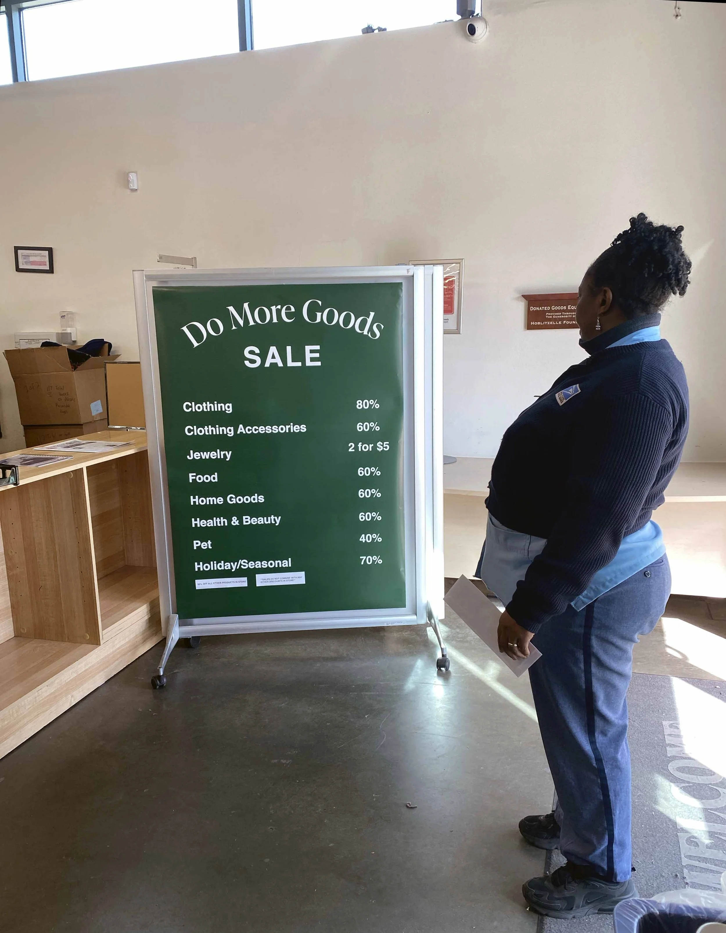
Challenge
Taking the math out of discounts
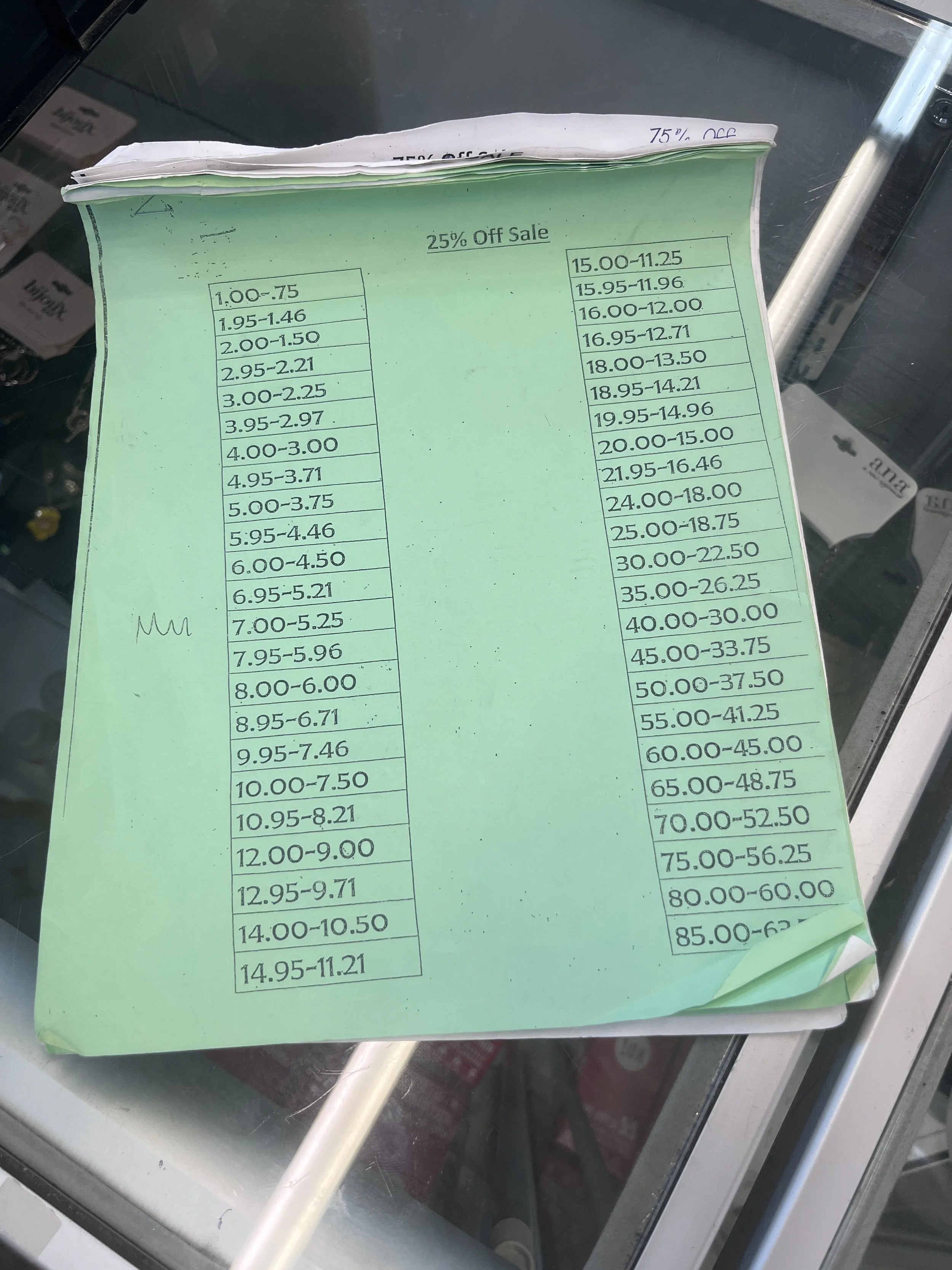
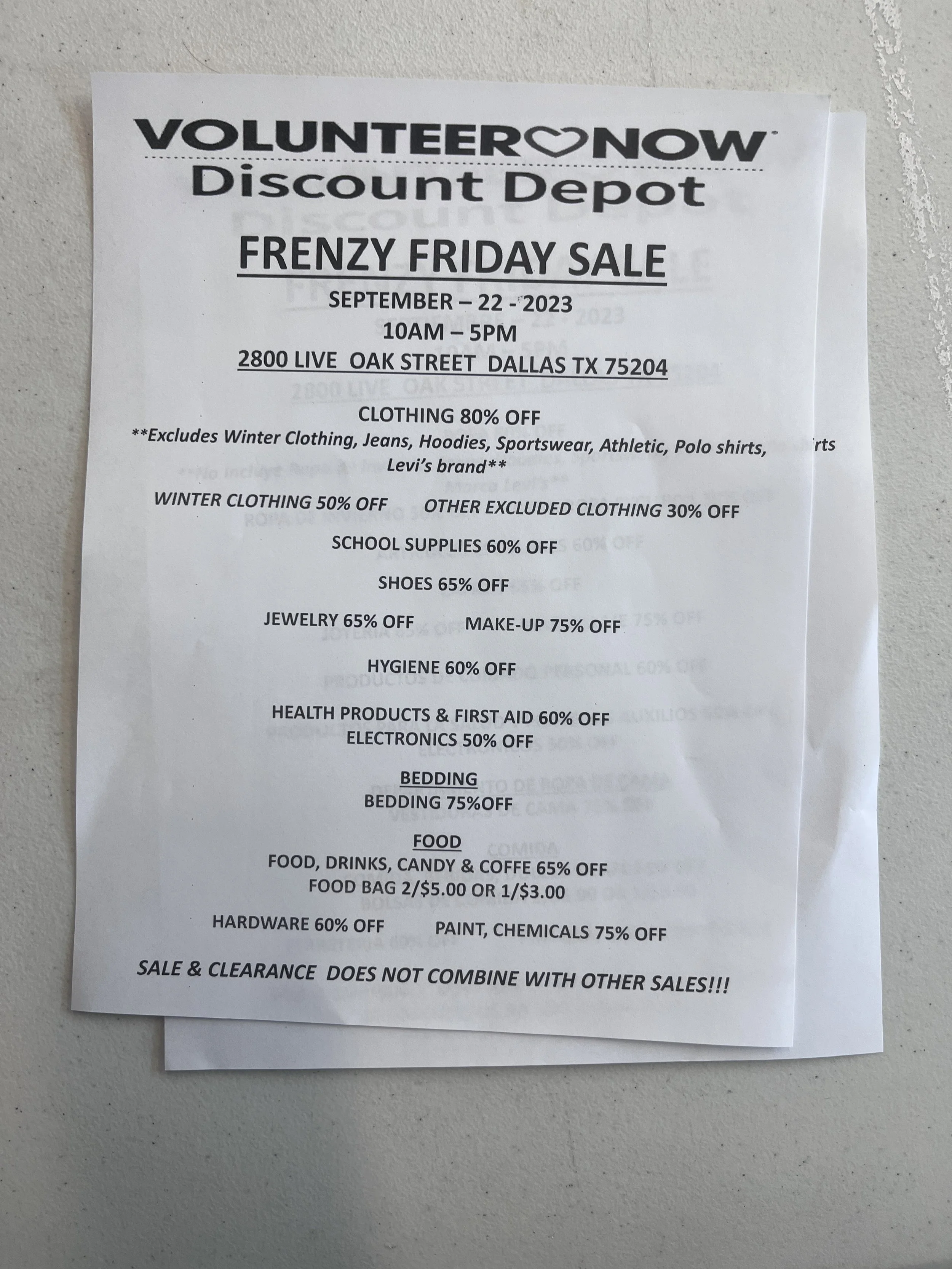
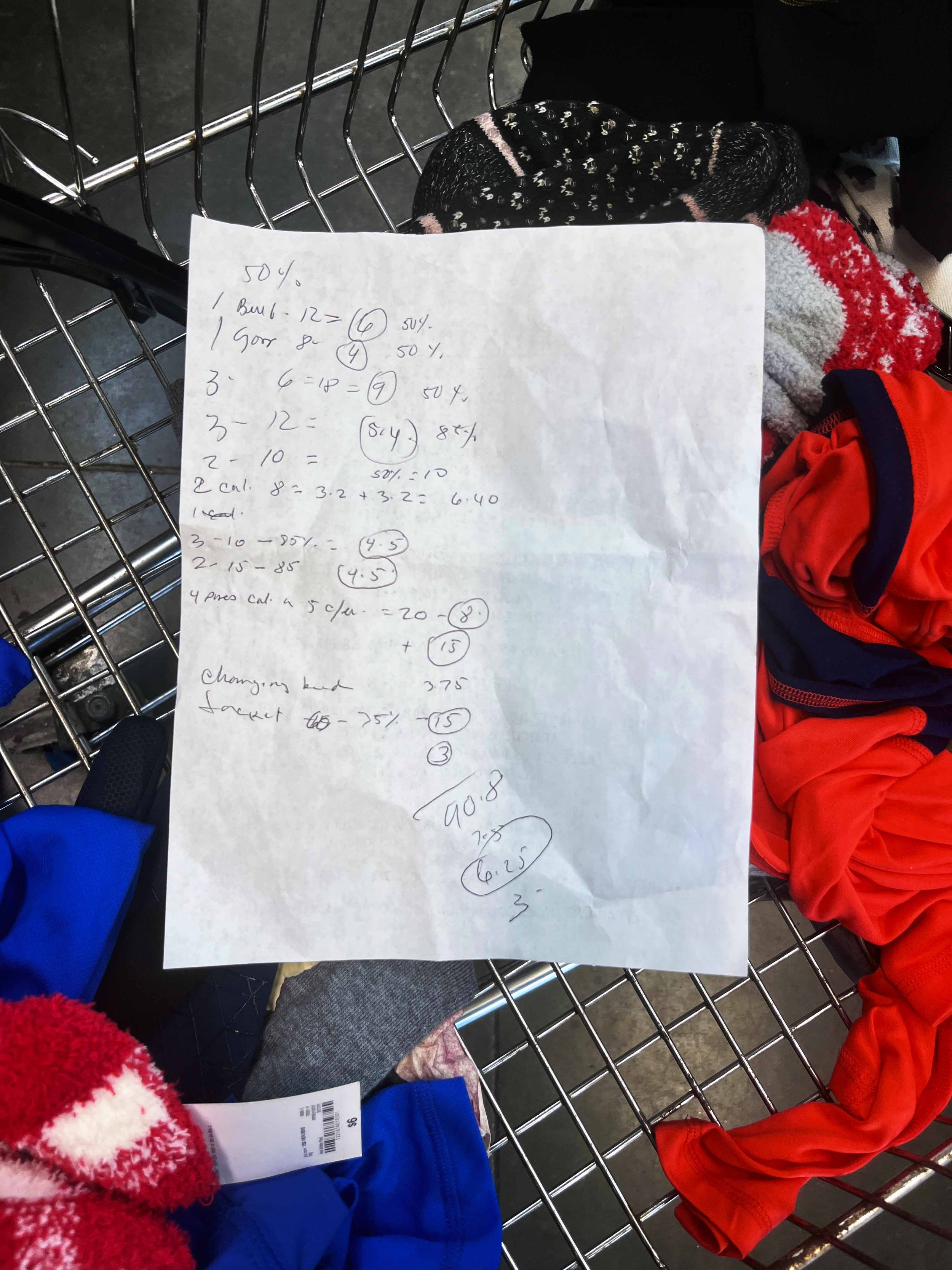
Discount Depot sells donated, never-used goods from retailers like JCPenney, CVS, and Target at deep discounts, supporting Volunteer Now and low-to-moderate-income communities. But inventory is unpredictable, and the discount sheet at the entrance changed every day. Customers and staff both had to work out prices themselves. In the field, we found a customer's math on a sheet of paper, left behind in an abandoned shopping cart. “Shopping here has become a headache (in regards to the sales and discounts). It’s a matter of figuring out how much it costs. I have to look for the sales paper, do the math, figure out what the sales are.”
—Do More Goods shopper
Insights
Clear prices, supported staff and displays that show care
1. Shoppers shouldn't have to do math to trust a price. The calculation left in the cart showed it. Customers and staff both valued consistent, clear pricing.

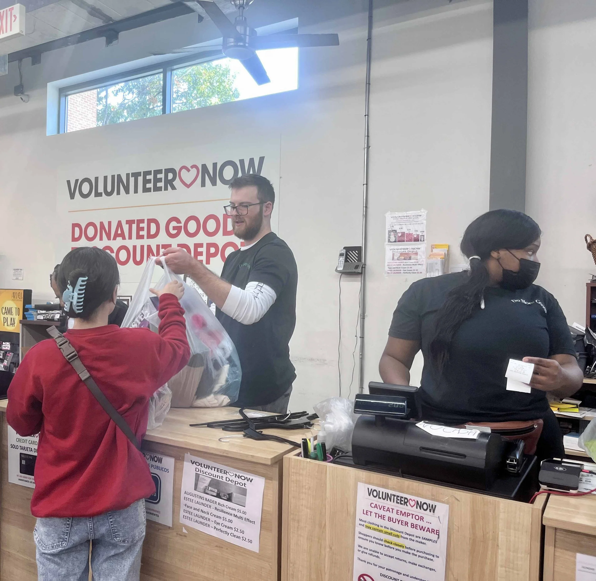
2. Clarity at the register is a staff tool first. The customer experience depends on how well staff are supported.

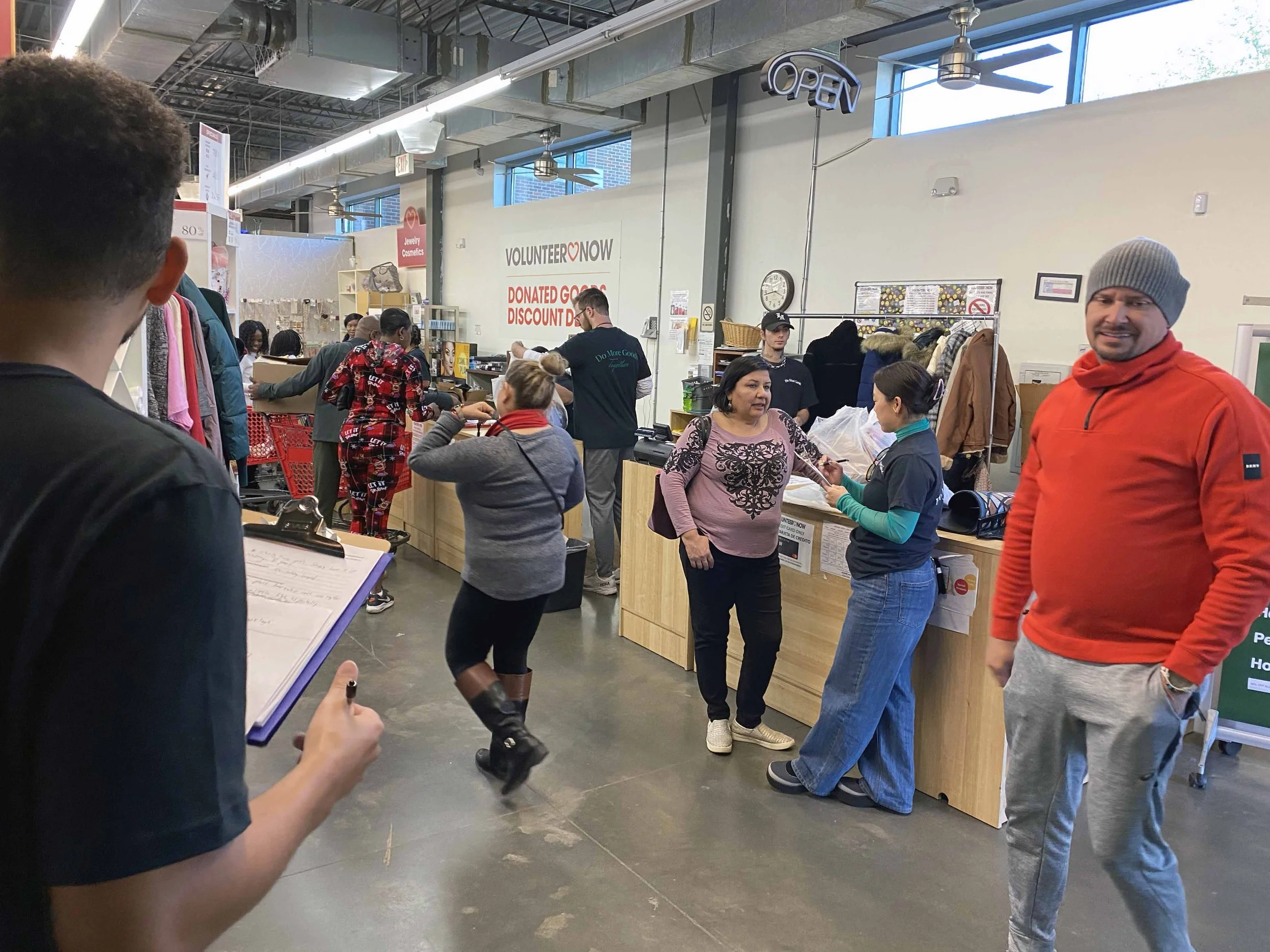
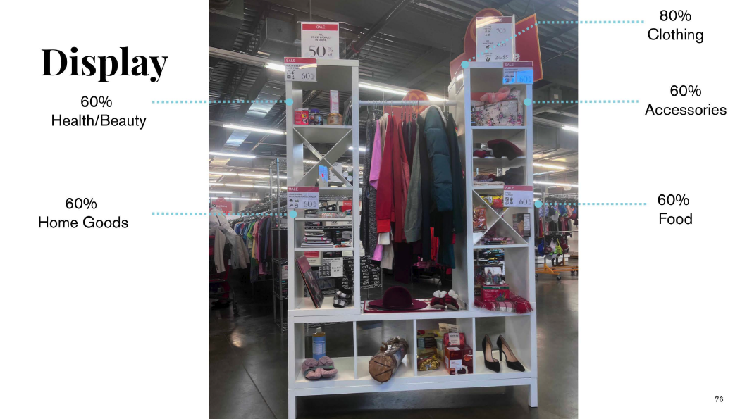
3. Intentional display/curation signals care. In the pilot, customers described the curated displays as modern and welcoming. 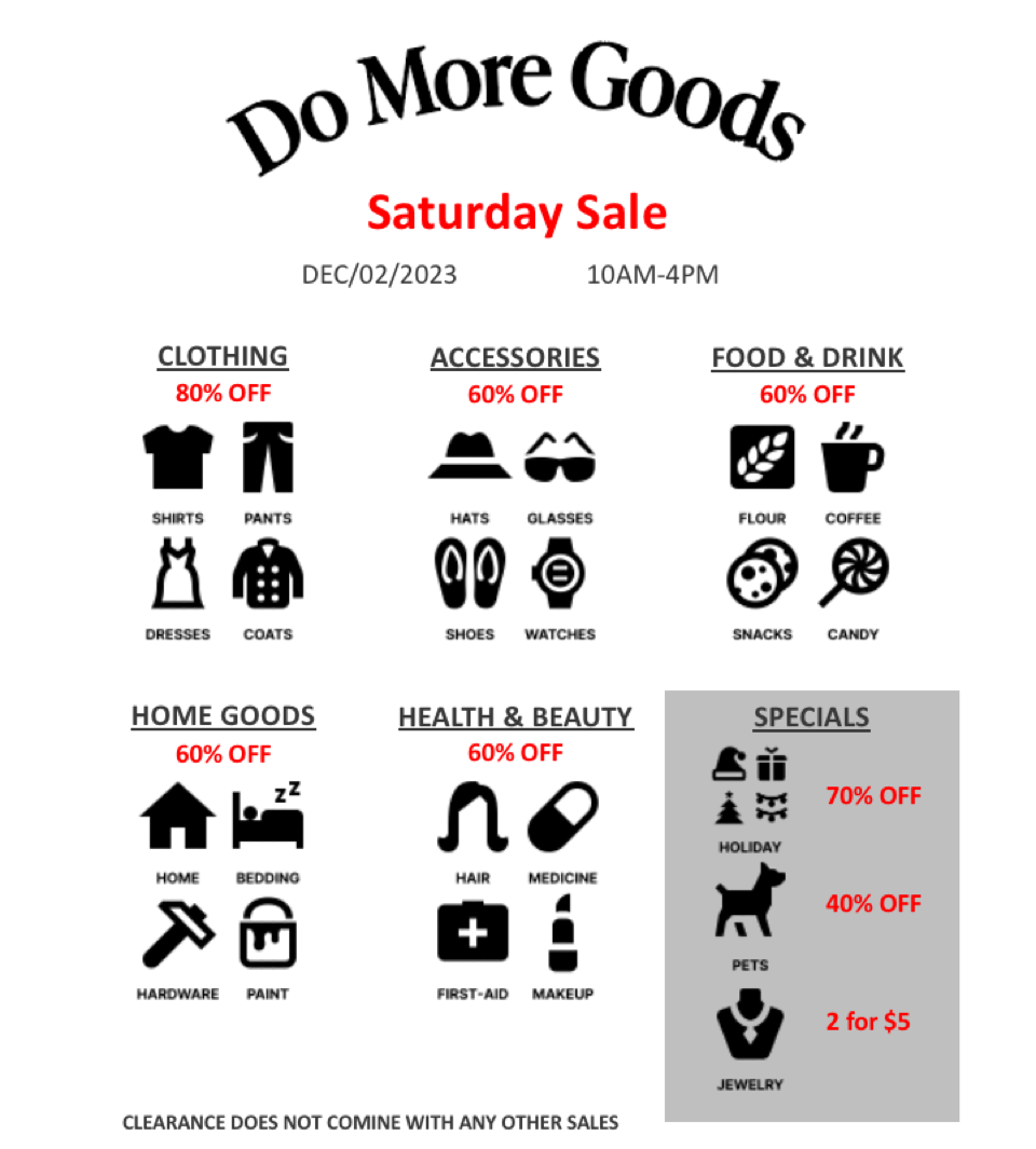
Solution
Do more goods, a one day pilot for an improved shopping experience for all
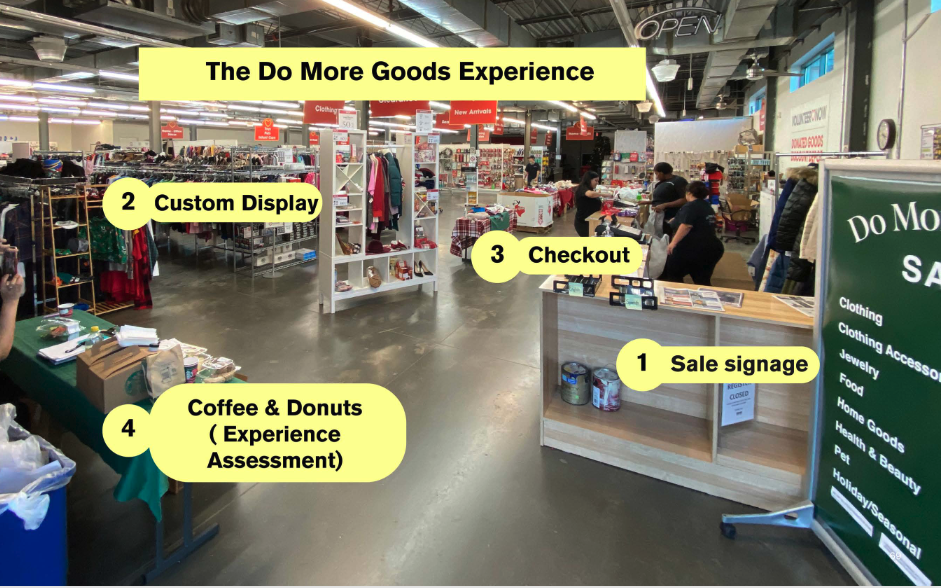
Working with staff, we built a one-day pop-up inside the store, branded Do More Goods, to test three questions: would clearly displayed sales reduce friction at checkout, would intentional displays sell more, and would removing the sales sheet hurt the experience? Seven discount categories replaced the daily sheet and its exclusions, based on the average of previously advertised discounts.
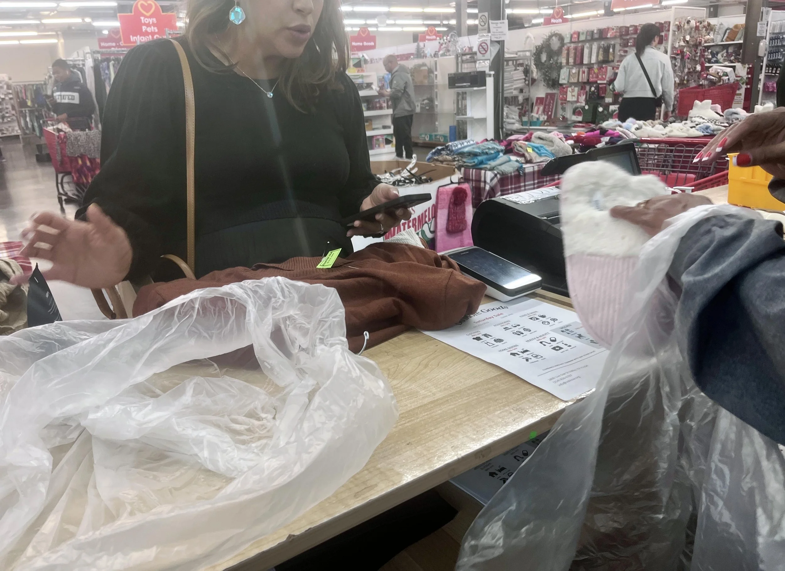
A visual, icon-based sheet for staff at the register. We flipped the sales sheet from a customer-facing tool into a staff tool.
Four connected touchpoints: sale signage at the entrance, custom displays for categories and featured products, checkout, and a coffee-and-donuts station [confirm what this was].